Featured:
Overview
The Corporate Analytics page displays a dashboard of high-level data about your organization’s productivity across all of your projects. It allows you to see how your organization is using PlanGrid features, compare usage over time, and understand the contributions of each team member.
The dashboard is located in the Admin Console under the Analytics tab and is only visible to organizational administrators. You’re able to export data from the dashboard in order to share it more widely.
Features
At the top of your dashboard is a showcase of actions taken by members of your organization. This gives you a quick snapshot of all of your organization’s projects. Top-level actions are visible to you regardless of how many licenses are associated with your organization.
There is a tile for each of the following pieces of data:
- Documents created
- Sheets uploaded
- Issues created
- Projects created
- Photos taken
- RFIs created
- Field Reports created

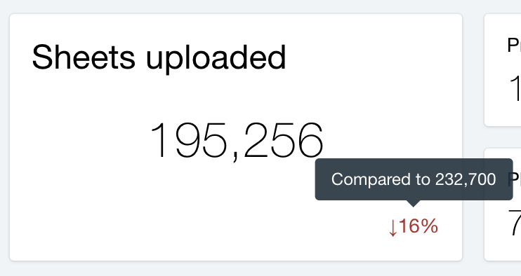
In the lower right-hand corner of each tile is a percentage change with either a green or red arrow. A green arrow indicates an increase in feature usage and a red arrow indicates a decrease. You can hover your cursor over the percentage change for more detail.

Date Picker
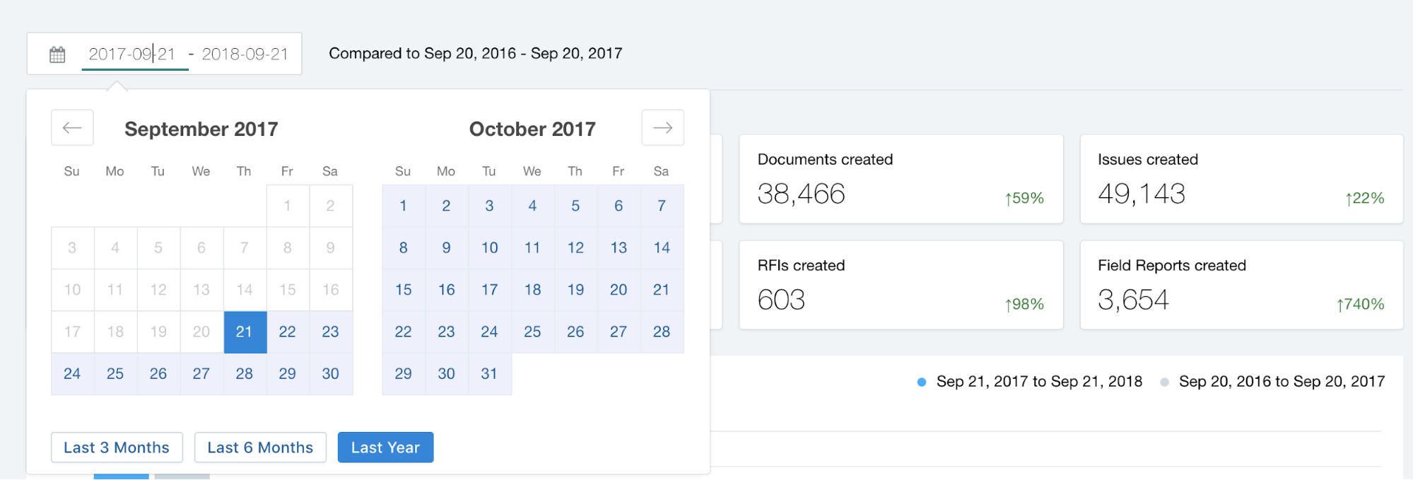
You’re able to view top-level actions within a custom date range using the Date Picker, which is above the feature usage tiles. Activate the Date Picker by selecting the current date range. Select a custom date range or choose between the last three months, six months, or year. The minimum date range is one month.
When you select a date range, the Corporate Analytics page will automatically compare your selection with an earlier period of time. The earlier period will be the same length of time as the date range you chose, ending with the day prior to the start of your date range.

Project and User Breakdowns
Underneath the feature usage tiles you’ll see data broken down by project and individual user. Here you’ll be able view more specific data that you can sort and export.
Please note that project and user breakdowns are only available to organizations with 10 or more licensed users. Bar graphs display data about feature usage, whereas the tables display data about feature creation.
Projects
A bar graph shows the percentage of projects using each individual feature in PlanGrid, displayed left to right from most to least used. The blue and gray bars correspond to date ranges specified in the Date Picker, which are shown in the top right corner of the graph.
Below the bar graph is a breakdown of feature creation by individual project and includes data on the following:
- Sheets uploaded
- Issues created
- Documents uploaded
- Photos uploaded
- RFIs created
- Field Reports created

This data corresponds to the date range selected in the Date Picker, and you can sort the list based on individual feature by clicking on the feature name. Export the data using the “export CSV” link in the top right corner.

Team Members
Below the project details you’ll find the same data broken down by team member. The bar graph shows what percentage of your team members have used each feature, and you’re able to compare time frames using the Date Picker.

Finally, you’ll see data about each team member’s creation of individual features:
- Sheets uploaded
- Issues created
- Field Reports created
- Photos uploaded
- Documents uploaded

Data will be displayed based on the time frame selected in the Date Picker, and you can sort the list by individual feature. Export the data using the “export CSV” link in the upper right-hand corner.

FAQs
How do I access the Corporate Analytics page?
Access the Corporate Analytics page through the Admin Console under the analytics tab. Note that you need to be a project administrator to have access.
What are top-level actions?
Top-level actions are actions taken by organization users on projects during the selected date range. You can think of them as a high-level overview of all of the activity happening on your projects over a particular period of time.
Why are there so many zeros for my team members?
There are a few reasons for why you might be seeing a lot of zeros in data for individual team members:
- Your organization might not be using some of the PlanGrid features listed on the Corporate Analytics page.
- Your organization might specify that only some users are responsible for specific features, such as creating sheets. This means that other users—those who don’t create sheets—won’t be counted.
- The creation of sheets or issues often depends on the lifecycle of a project. You may be selecting a date range that doesn’t encompass the period of time during a project when certain features were used.
Why do the numbers for sheets and issues not match what I see for projects in the PlanGrid app?
The data displayed on the Corporate Analytics page is only a subset of data that can exist in your projects. It’s restricted to a certain date range, which you can specify at the top of the dashboard. If that date range doesn’t encompass the entire time frame of your project, the data for that range won’t match the total for the entire project. For instance, if you’re viewing the number of sheets created, the dashboard will display the number of sheets created in your chosen date range and not the number of sheets created in your project as a whole.
What happens if I delete projects or users?
Deleted users and projects won’t be displayed on the Corporate Analytics page. It only displays content for users and projects that are active. Historical data is also limited to active users and projects.
What does it mean for a feature to be “used” in the context of a project or user?
“Used” simply means that we’ve registered any activity in a particular feature by a user.
Why can’t I select data from more than a year ago?
We’ve limited the selection to a year so that you can easily compare data to a previous year.
